Google Chrome
Improve chrome’s tab management, bookmarks & history
Role
Sole UX Designer
Time
80 Hours (4 weeks)
Tools:
Figma, Figjam

Project Background
Browsers are one of most useful inventions and heavily utilised pieces of software out there, connecting us to countless applications and websites, eliminating the need for downloading dedicated software. Google Chrome, with around 2.65 billion global users with 63.58% market share, is a widely used browser.
While the ways people utilise and the reasons behind their internet usage have evolved over the years, Chrome, unfortunately, has not quite kept up with these changing needs. This lack of evolution has resulted in users facing challenges when trying to navigate Chrome efficiently. A prime illustration of this is how Chrome tends to become unwieldy as the number of tabs multiplies.
My aim with this project is to enhance the internet browsing experience within Chrome.
Solution
Making chrome’s actions more accessible
The most frequently used actions such as forward, back, search, and tabs are now conveniently accessible from the bottom for enhanced user convenience.
Bookmarks
Articles
16
My Docume...
9
Coffee Tech...
4

My Google drive
My Travels
1
Current Tabs
Blogs
12
Books
8
what is design...
Travel Itena...
1

r/F1Technical
Google Search

r/F1Technical
r/F1Technical
History
Today
My Google drive
r/F1Technical
34
Flight to Mumbai

Kindle Paperwhite
Yesterday

Goodreads
r/F1Technical
34
Tajmahal in india
Cricket - India vs S
Cricket - India vs S
13 Sep
Goodreads
r/F1Technical
34
Tajmahal in india
Cricket - India vs S
Cricket - India vs S
google.com
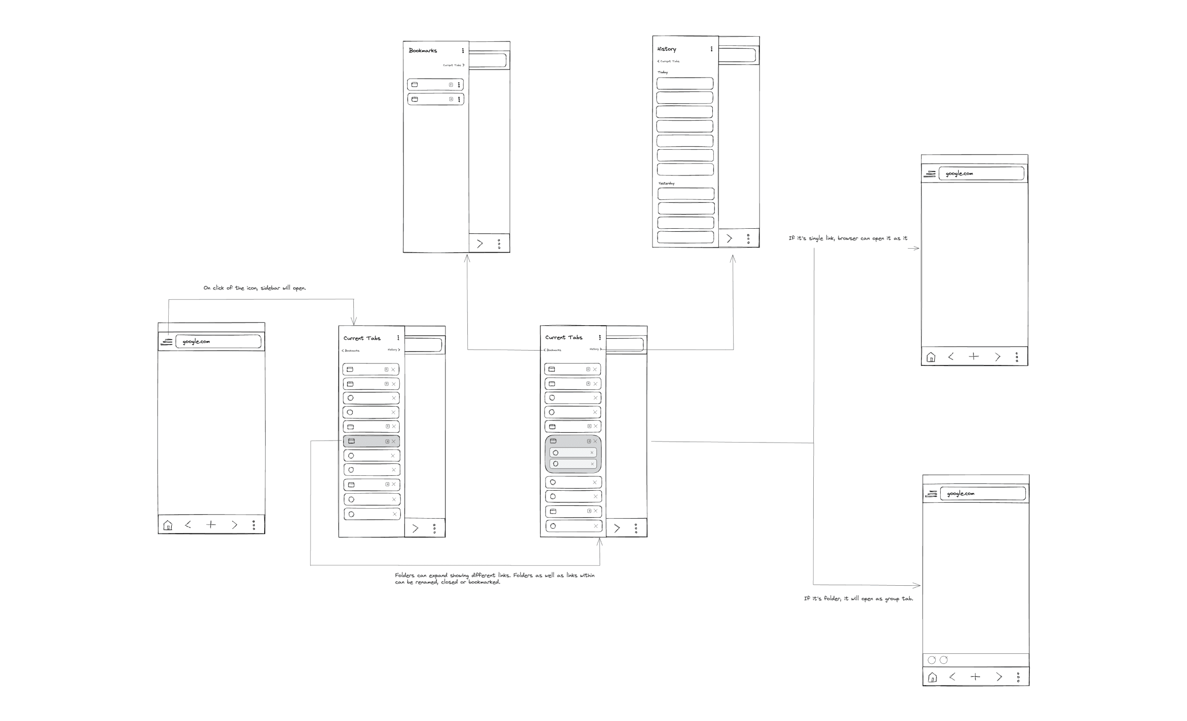
Introducing a new location for Google tabs
As current tabs, bookmarks, and history all involve links to webpages on the internet, they have been consolidated into a single sidebar for easy access and organization.
Introducing Tab Folders
Frequently, the current tabs and history sections become cluttered with numerous similar links, making it challenging to locate a specific link within the sea of tabs. Tab folders have been introduced to group similar links, thereby enhancing the user experience with a clutter-free approach.
Bookmarks
Articles
16
My Docume...
9
Coffee Tech...
4
My Google drive
My Travels
1
Current Tabs
Blogs
12
Books
8
what is design...
Travel Itena...
1
r/F1Technical
Google Search
r/F1Technical
r/F1Technical
History
Today
My Google drive
r/F1Technical
34
Flight to Mumbai
Kindle Paperwhite
Yesterday
Goodreads
r/F1Technical
34
Tajmahal in india
Cricket - India vs S
Cricket - India vs S
13 Sep
Goodreads
r/F1Technical
34
Tajmahal in india
Cricket - India vs S
Cricket - India vs S
google.com
And here’s how I got there:
Research
To better understand users’ challenges, I conducted comprehensive research to delve into the user needs, preferences, and behaviours. This involved initiating an secondary research, followed by user survey and user interviews.
Secondary Research
During this research, I explored many open data sources that could provide insights on browsing experience, pro and cons of different browsers as well as analysed discussions and forums like Twitter and Reddit to get unfiltered experiences from users.

Reddit posts from users posting about their experience and asking for better tab management

Tweets from users posting about their experience and asking for better tab management
Furthermore, I identified that some users have turned to third-party browser extensions, both free and paid. These extensions, available in the Chrome Web Store, offer a range of solutions to overcome these challenges. In fact, there are tens or even hundreds of such extensions catering to various needs and preferences. Based on my initial research, I've identified several common issues that users frequently encounter:
Managing large number of tabs
Finding a specific tab among 10s or 20s tabs
Bookmarking tabs for future references
Finding a specific session or tab by going through history
Too much clutter in the browser
Competitive Analysis
I conducted a comprehensive competitive analysis of other popular browsers to gain a thorough understanding of their behaviours and the reasons behind their distinctions. My primary focus for this analysis was comparing the information architecture of different browser.

Based on the competitive analysis, it can be concluded that Safari and Edge stand out with their user-friendly approach, featuring a multitude of readily available options on the screen. In contrast, Chrome and Firefox have fewer options that are not as prominently positioned, making them less accessible in comparison.
User Survey
I conducted an initial survey involving 12 participants, to establish a preliminary grasp of user challenges and behaviours.
Participants
12 Users
Ages
18 - 60
Gender
Mixed
Key Insights:
An impressive 66.7% of users opt for Google Chrome as their preferred web browser for a wide range of purposes in their daily lives
Performance, user experience, and privacy, in that order, represent the top priorities for users.
All users unanimously reported that they frequently find themselves opening a substantial number of tabs


User Interviews
I utilised the user survey for screening participants for subsequent user interviews. These interviews were conducted both in-person and online to gain deeper insights into user behaviour and internet usage patterns.
Participants
4 Users
Ages
21 - 34
Gender
Mixed
The interviews provided the following insights:
Tab Overload
Participants unanimously agreed that once the quantity of open tabs exceeds a certain point, it tends to lead to confusion and disorder.
Bookmarks,
helpful yet cumbersome.
Participants expressed a desire for a more user-friendly bookmarking system that streamlines the process of both saving and retrieving links.
Simplicity
Some participants value the simplicity of Chrome and Safari, citing their easy learning curve and efficiency in accomplishing tasks.
Desktop for Depth,
Mobile for Speed.
Participants use desktop browsers for complex tasks and turn to mobile browsers for simpler ones.
Define
Following the research phase, I proceeded to organise the gathered information from last stage into personas, HMW statements and sitemap..
Persona
I developed a user persona that embodies the feedback and opinions shared by actual Google Chrome users in my interviews and survey responses. Consistently referencing this persona throughout the design process ensured my solutions aligned with users’ core needs and effectively addressed their issues.

Design Challenges
To reinforce the project's direction, I translated research insights into "How Might We" statements, which centered on both user needs and goals. This approach helped me to distill the common themes of the challenge and empathize with the users, resulting in human-centered solutions generated through brainstorming.
“How might we simplify browser's tab management for users with a high number of open tabs?”
“How might we improve the user experience for saving and retrieving browser bookmarks?”
“How might we create a simple and user-friendly experience for locating links in browsing history?”
Sitemap
Based on the competitive analysis conducted on the information architecture of various browsers, it was observed that:
Safari and Edge feature numerous options readily available on the screen, making them user-friendly, whereas Chrome and Firefox have fewer options accessible directly.
The bottom bar represents one of the most popular navigation styles in mobile design. Positioned in the easily reachable zone, it ensures convenient access for users via their thumb. It's worth noting that all other browsers, except Chrome, leverage this feature to enhance their usability.
Furthermore, it was observed that Chrome places all its actions in a less easily accessible top zone. So, I divided the actions into distinct sections to eliminate clutter and ensure each action is easily accessible.

Design
After completing the research phase and defining key elements, I initiated the development of solutions.
Sketching solutions
Once I had finalised the information architecture and defined the key pages, I began sketching potential layouts and explored different directions for the design

Version 1

Version 2

Version 3

Version 4
Low Fidelity Mock
After sketching out several potential solutions, I moved on to develop low-fidelity mockups. Commencing the design process with sketches enabled me to swiftly explore various alternatives, facilitating the selection of the optimal direction for the redesign.
High Fidelity Mocks
I incorporated patterns and elements consistent with the existing interface in the Google Chrome browser, ensuring that users would find them familiar. Recognizing that Google Chrome offers both light and dark mode options, I developed high-fidelity mocks for both modes.

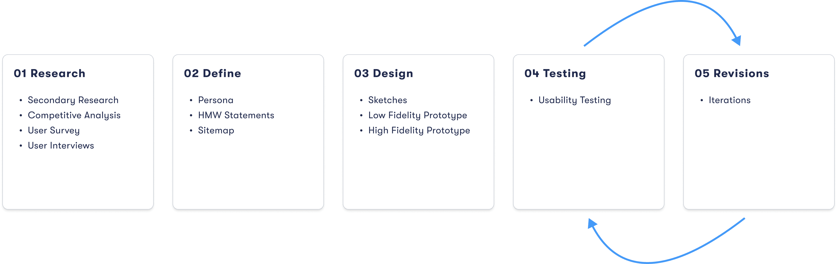
Testing
After creation of high level mock and prototype, I conducted usability testing to test the website and gather insight about user’s behaviour.
Usability Testing
I conducted a usability test with 5 participants who fit my target audience. These were conducted over the course of 3 days and were moderated in-person. Users were asked to explore new designs and complete the tasks. I had each user narrate their thoughts and initial impressions to get a deeper understanding of their behaviour and perception of the website.
Test Objectives:
Test overall flow and navigation of the proposed google chrome design.
Check if users can able to navigate to bookmarks and history
Check if users are able to use the bottom bar to browse different webpages.
Test Results:
All participants were able to navigate to different pages using the top and bottom bar.
60% of participants were able to navigate to bookmarks and history without difficulty, while the remaining participants encountered some mis-clicks and confusion but eventually succeeded.
Various pain points were also discovered during these tests (more on this below)
Iterations
Priority revisions were made based on my usability test feedback. The changes implemented are as follows:
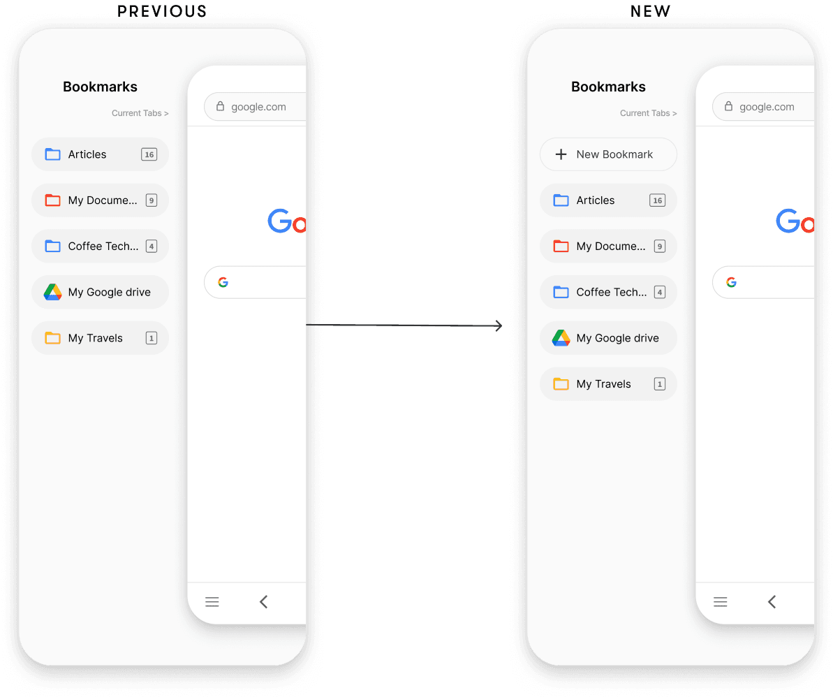
Introducing the 'Add New Bookmark' Action
Some participants raised concerns about the inability to add bookmarks directly within the bookmark list. They suggested that it would be more convenient to have the option to add bookmarks directly in this screen.
Bookmark and History buttons were not accessible.
Both the Bookmark and History buttons lacked prominence, making them less noticeable. Additionally, their small size led to instances of mis-clicks among participants.

Conclusion
Reflection
This project was quite an interesting one. Enhancing a well-known and widely-used browser like Google Chrome presented a unique set of challenges. It was an exciting opportunity to craft a creative solution that could enhance the user experience for a broad audience, all while staying within the familiar patterns and elements of Google Chrome's interface.
These takeaways have equipped me with the skills and mindset needed to design products that are not merely functional but are designed with the user's well-being and satisfaction in mind. As I move forward in my career, I'm committed to applying these principles to create meaningful and transformative experiences for users.
Future Goals
Get this product into the hands of more users for further validation and continue refining the app.
This project is primarily centered around mobile usability. Next, I will shift my focus towards enhancing the user experience for desktop Google Chrome.